Now the HARD part!
First, Select the polygonal lasso tool and select the layer where the Tank is. Now select the part of the cannon that is going to be broken. Once you lasso the area of the cannon, you will then see the dancing ants, now hit Ctrl + C, and then Ctrl +V. The part of cannon that has been cut is now on a new layer. Select this layer and then select the box 'Show Transform Controls'. Now you can rotate the broken cannon to actually look like the one on Tom's shirt.
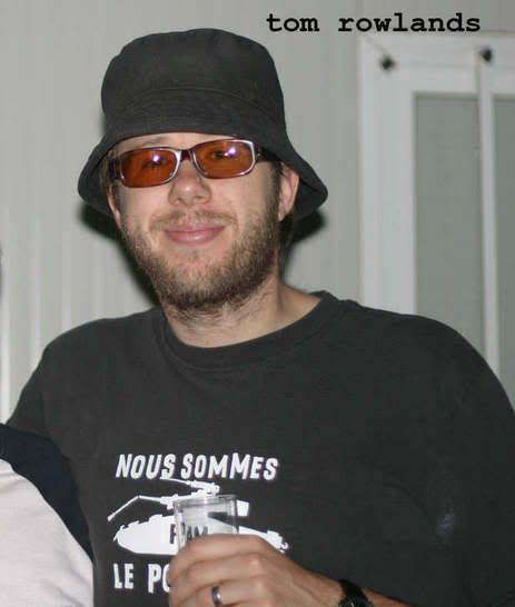
The tank is done, so lets move to the text part of it! Let's look at both the 'Salaires' pic and Tom's 'Nous Sommes' pic. as you can see, the letters from 'Salaires' pic are pretty unrestricted, meaning the spacing between letters (tracking) the lack of a bassline, and the rugginess of the letters give it personality of its own. In this case, we must keep these letters in intact, and they cannot be edited because the artwork is a one of a kind. Note: If there IS a font of this, don't use it, because the font will probably have smoother characters, cleaner lines, and will lack the integrity of the original artwork. WE DO NOT WANT TO DO THIS!
Look at the 2 pics, the 'salaires' pic, and the Toms 'nous sommes'. As you can see, some of the letters from 'salaires' can be used for our 'sommes' shirt. So I copied the these letters from the 'salaires' pic by using the polygonal lasso tool and then pasting them into the tank document.
(This is probably the hardest part to when I was making this shirt.)

The other letters that you need to complete the 'Nous Sommes Le Pouvoir' are N, M, P, V. These letters will have to be traced as perfectly as possible from the 'sommes' pic (This is the really hardest part of the shirt). The P can be done more easily by making a copy of the 'R' letter and trimming to look like a P.
Once all the letters are all done, your artwork will be complete.......oops....not yet....!
Save your PS file on your computer.
Get the Tom's 'Nous Sommes' pic and drag into your tank document. Make sure the 'Nous sommes' pic is the bottom layer. Now, set the opacity for the tank and the letters to at least 50 percent because now you will have to allign the tank and the letters to tom's 'nous sommes' pic. By doing this, your making this shirt more precise as possible. The below pic shows the tank and letters are now 50 percent transparent and you can see the 'nous sommes' pic right below it. Use arrow keys to for more precision.

Once you have the tank and letters alligned, save your work! Now delete any layers that you are not using anymore. Just keep the letters and tank on a single layer (or layers) Now save the file as a EPS file (this format can be used and read by vinyl lettering cutting machines to print on your T-shirt. If you save it as a pdf, tiff, jpeg, or png, etc, the printmaster may convert the artwork into vector based (outlines) before he prints it on the shirt. If he or she does this conversion, please ask to look over to what he or she is doing because sometimes the conversion might alter the lettering and might ruin the way you wanted the artwork to look like in the first place. (Remember what I said about the integrity of the original artwork


Here's the file
http://www.zshare.ne...30686749eee2b9/
@WN
Use this as a guide! I think you can do a much better job on the letters than I can. Oh and one more think. On Tom's shirt, if you look at the word 'Pouvoir', look closely at the letter 'o'! It looks like there's something inside it. It might be a target reticle or a peace symbol!! It's hard to tell, so I put a peace symbol on my shirt anyway.
Good luck!


 MultiQuote


)
)